HOW TO REDESIGN YOUR PUBLIC AREAS.
by Elisabetta Boldrini - Project Manager
«...Go back to the drawing board...»
Way to go back to the drawing board? The reason is obvious. There are not only rooms in a Hotel.
That’s why we have to go back to the drawing board: to redesign public areas as well.
On the other hand, after the facades, these areas are the second element on which your guest based his opinion. Anyway, before going to the room, he passes through these environments, no? So, let’s put our own here too.
And then you know, half things don’t happen, either for good or for nothing.
But if that’s not enough to convince you, I’ll tell you more.
Your guests’ needs change, and they constantly change, as does your target audience.
And if you don’t want to renew your public areas every year (of course we will be happy), you have to make these spaces functional to satisfy the various needs that may arise.
«What to draw?»
Now that we’re comfortable at the drawing board, my question is “what to draw?”.
Definitely more functional or better multifunctional spaces (I already said it?).
And so yes, to lobbies, breakfast rooms, small rooms designed to encourage conviviality, coworking and that can be used for different uses such as working, relaxing, eating, waiting, meeting for business meetings etc..
This type of design is useful especially for those who don’t have many/large spaces, as it allows not only to make the most of the existing ones, but also to optimize them and make them suitable for all the needs that a guest can have.
So, for example, don’t you have a conference room? It doesn’t matter (no extension is planned), just insert the seats and tables, in the breakfast room or in the lobby area, which offer guests the opportunity to work and also to hold business meetings.
So your breakfast room will not only be an area where your guests have breakfast but will become a real work space.
And you know, with a croissant near everything is easier 🙂
But that’s not enough. No, because I imagine that you would never want to have or design (in case you are an architect) anonymous public areas.
For this reason, it’s important for me to also include personalized details, custom furniture, that also reflect the brand or the philosophy of the latter.
(Do you want seats, upholstered with custom fabrics? We can provide them).
The keywords for these elements are: aesthetics and functionality.
Just as in high fashion, the dresses and accessories are characterized by the high quality commodity, the refinement, but above all by craftsmanship and creativity work; so, too, your’ Hotel, your projects can be marked by these factors, assuming a unique and valuable aspect.
And if you have a chain, this speech is worth even more.
Because, even if every Hotel must have its own distinctive character, it is beautiful and right to include common elements, maybe revisited, to create a link and to represent a factor that strengthens your brand identity.
Not to mention the case in which the restaurant of your structure is also open to external customers.
In fact, here, it’s necessary to design an attractive environment, that’s able to intrigue passers-by and push them to enter, for this design and subsequent work require more time and study.
I think you agree with me, right?
And also, the experiential component it’s fondamental, for this reason it’s necessary to pay attention to the choice of materials, colors, and furniture. But we have already written an article about this; so, I won’t dwell on it too much (if you’re as curious as me, read it here).
Obviously, the public areas must be in harmony with the rest of the Hotel, but not only in color, materials, style level, but also in terms of the atmosphere and philosophy that you want to recreate.
For this reason, we shouldn’t focus only on the rooms, or public areas, but on the whole structure.
Finally, public areas must have an essence: yours essence.
«We open AutoCad»
Eh, yes, we have to design public areas, so we have to open AutoCad to create the project.
And then, we have to make real what we have idealized and analyzed.
Well, public areas is a general term, let’s go by areas, what do you think? We start from the lobby and reception area.
I’ll show you, you know I like them, three different lobbying projects that we’ve realized.
Let’s start from the first, Crowne Plaza Zurich.
The Crowne Plaza Zurich has a sparkling style, characterized by a perfectly harmonious dialogue between the public areas and the rest of the Hotel.
For the design of this area, we started from the drawings of the architect Guglielmo Ori, and we refined the choices of finishes, furniture, lighting and decorations.
The colors are bright, and the soft tones have been enlivened by touches of color more intensely, and the seats and tables of different sizes and styles create a lively and modern environment and they also give, to this area, a certain multifunctionality.
We have created different fake carpets, under each space with seats, to break the continuous flooring, and to enclose, emphasize, point out the different functionality of these micro-areas and then give, to the guests, the impression to have more privacy.
And the before and after is just great.
The lobby at Crowne Plaza Zurich is a perfect combination of functionality and style.
On the other hand, the lobby and reception area of the Hotel Base Vevey is quite different.
Here the keywords are: comfort, services and smart technology.
In fact, this area, although small, offers to the customer the opportunity to check-in and check-out independently, to print tickets for anything and to see in preview, through screens, your own apartment-room booked.
In addition, high-quality and sustainable materials were used for this project to embrace the eco-responsible and innovative concept of “Base” idealized by the architects of the company Norwood.
I promise you, one last example and then we move on to another “drawing”.
The last lobby I want to show you is that of the Boutique Hotel Ambassador.
Here too, the style is totally different from the others.
In fact, it was decided to recreate a refined and elegant atmosphere, made possible thanks to the use of soft but decisive colours, as well as elegant furniture.
The large windows also create a connection between inside and outside, immersing the guest in the surrounding landscape.
«Let’s move on to another drawing»
I promised you, so let’s move on to another drawing.
The public areas don’t only concern the lobby and reception area, but also the restaurant area is a “part of it”.
We have already seen what characteristics this area must have (do you remember them?), so, now, I want to show you some projects concerning the Hotel’s restaurant.
To do this, we fly to Guinea, precisely at the Oyala Complex Palace.
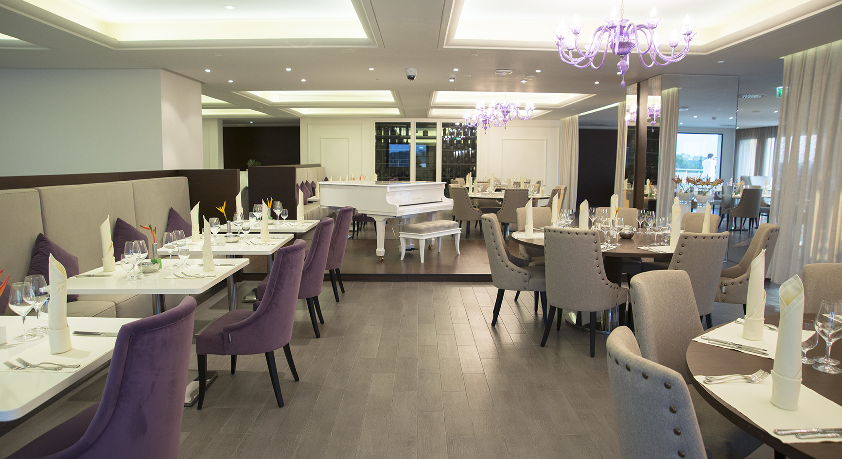
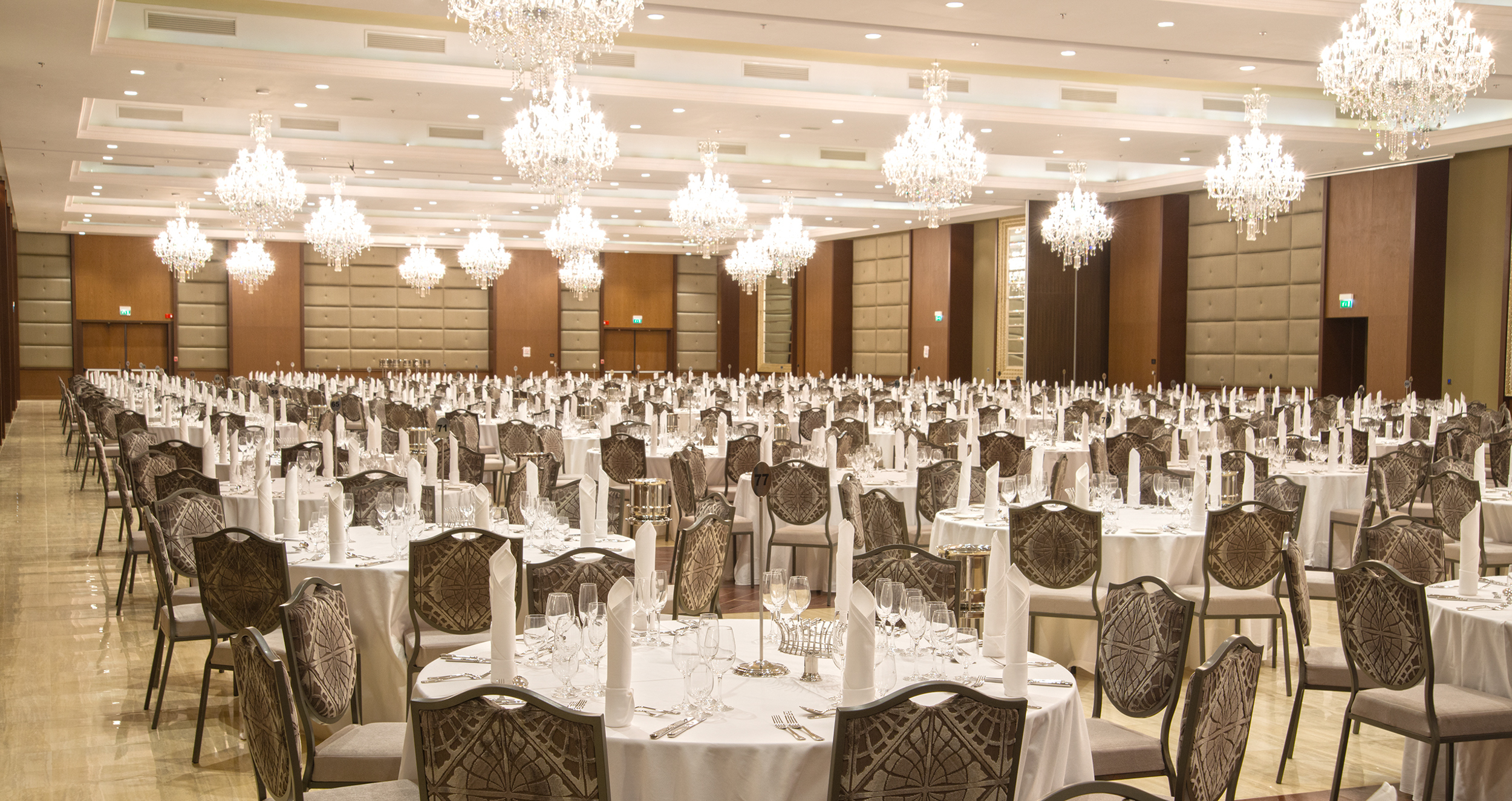
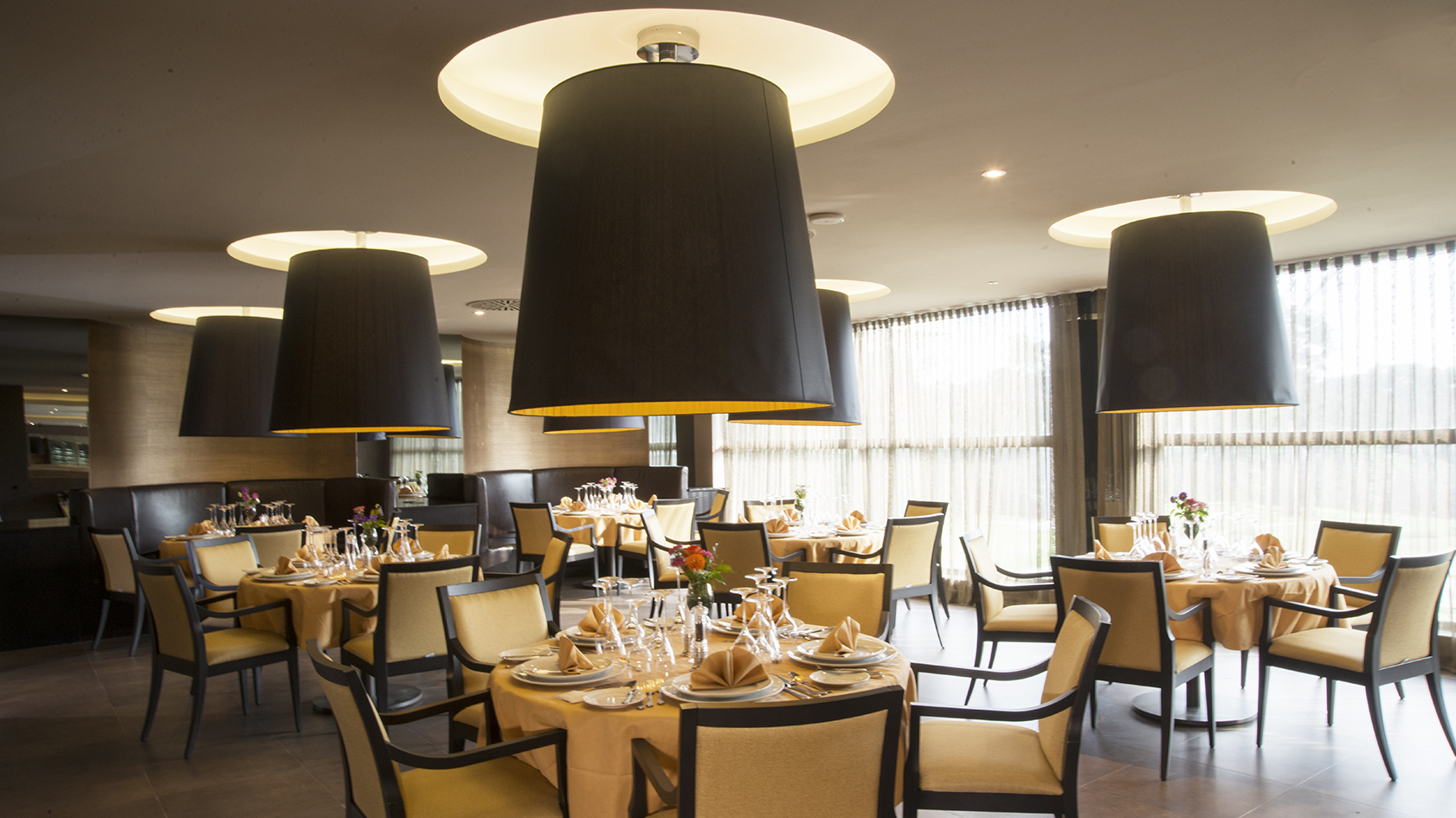
And in this five-star complex, gentlemen, we don’t have only one restaurant, but three.
In fact, on the sixth floor there is an Italian restaurant with a kitchen and terrace. On another wing of the Hotel there’s a three meal restaurant, on the first floor there is a lounge bar and a steakhouse restaurant.
All these environments are characterized by our stylistic touch, and great attention was paid to detail and to the choice of materials, combining the use of the most classic and the most innovative ones, for a touch of absolute modernity.
These projects are also characterized for the absolute immensity of spaces.
The Italian restaurant, in fact, has 104 seats inside and 100 outside, the three Meal restaurant instead 304 seats and finally the Steakhouse Restaurant has 268 inside and 96 in the terrace area.
Let’s go back to our areas, specifically in France. Here we have recently concluded the project of Domaine du Mas De Pierre.
Samuele has already told you about this artistic project in an article. Today, I want to focus on the restaurant area of this project.
Yes, because here, we have created a real masterpiece: the Oste table. The Oste is a table of 5.6 made entirely of oak wood.
I’m not telling you about the immense research that the technical department had to do to search suitable oak boards, and all the post work that we had to do to realize it.
Even the counter has been completely restored by us, as well as the boiserie, the seats and tables, to give it a more modern touch while respecting the atmosphere of the Relais.
«The latest drawing»
Lastly, then we can rest.
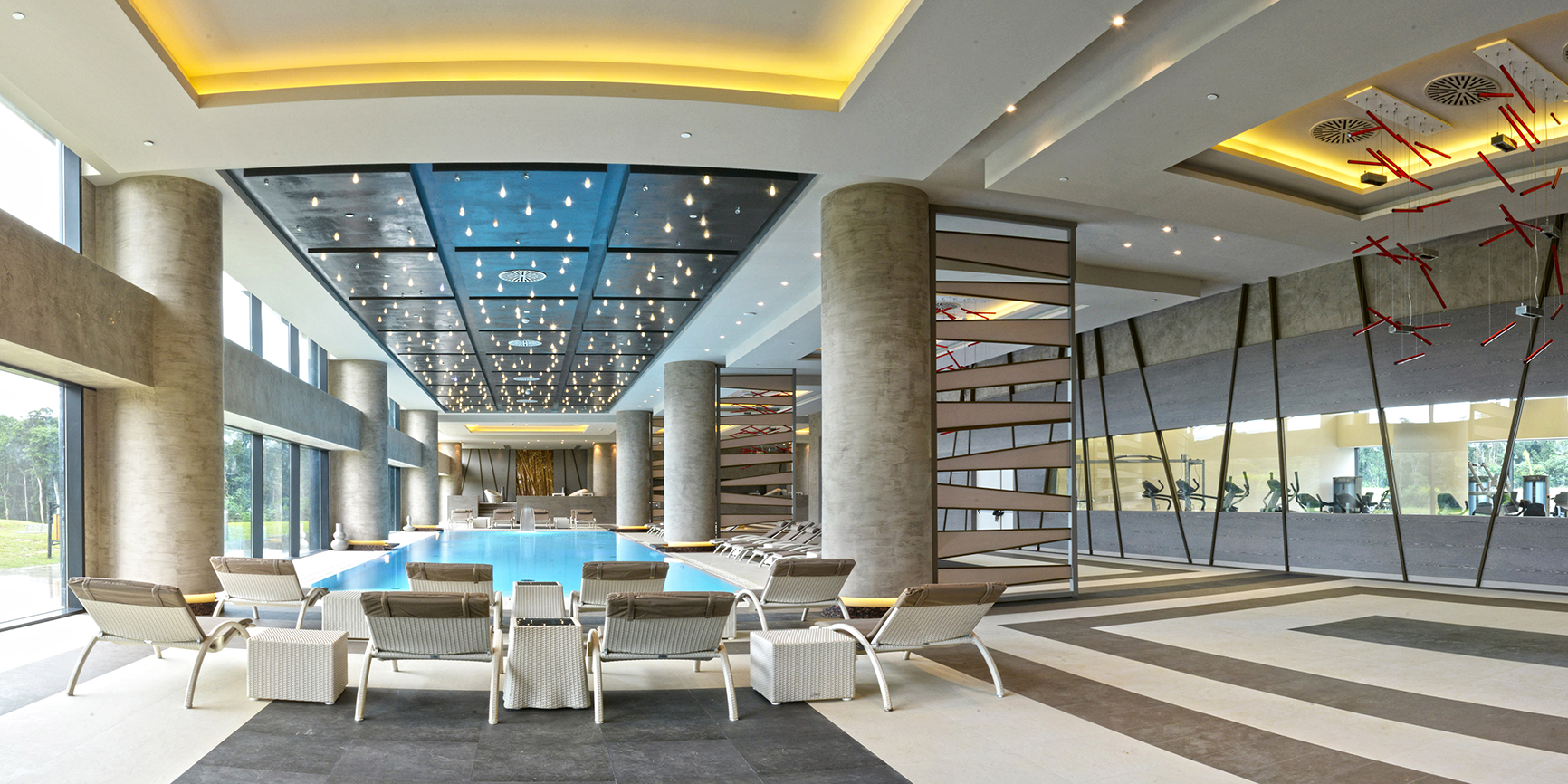
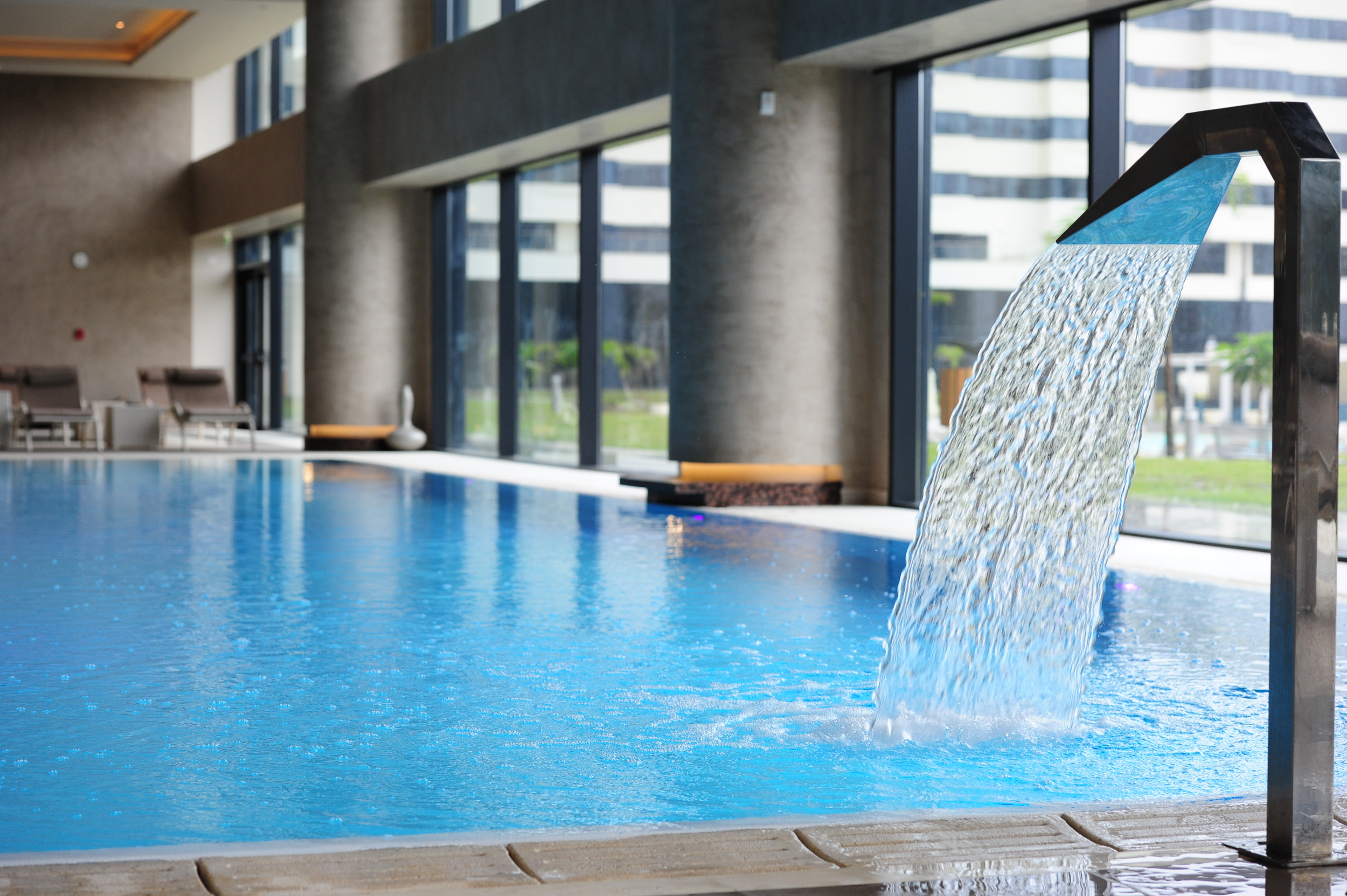
In your opinion, can we miss the Spa? Not, of course, it’s a part of public areas.
What to say… a Wellness area obviously must not only respect aesthetic standards but also functional standards, and the materials used must ensure high-performance in terms of durability and hygiene.
For the construction of this area of m2 1650, we opted for the combination of classic and innovative materials. Spotlights have been inserted in the ceiling of the wall above the pool to create an intimate and comfortable atmosphere, especially at night.
In addition, there are some partitions that divide the different spaces of the Wellness area without separating them permanently.
«Switch off AutoCad»
Yes, the public areas project is finished.
If all these areas analyzed coexisted in a unique Hotel, it would just be great, wouldn’t it?
And who said it can’t come true? Of course tant It can come true and we can help you do it.
As you can see, it isn’t necessary to make major interventions to improve public areas, but to make the right ones, in order to exploit and optimize every space at its best.
Remember which are the key words to redesign public areas able to meet the heterogeneous needs of your guests: functionality, multifunctionality, customization, attractiveness, services and experience.
Obviously, the speech would be endless, and I can’t reveal all the tricks of the trade, contact us to know them all.
Author: Elisabetta Boldrini
Position: Commercial Director
- ARCHITECT BY PROFESSION.
- HOTEL ROOMS: THE VARIETY OF STYLES THAT YOU MUST KNOW.
- IN THE CLIENT’S SHOES.
