HOW NOT TO BE ASHAMED OF OUR FACADES ANYMORE.
by Elisabetta Boldrini - Project Manager
«Beautiful inside... but what about outside?»
Here l am, writing again, and l’m going to go against the tide.
We always refer to inner beauty, “the important thing is to be beautiful inside”, l imagine you have heard this at least a hundred times. This is a very correct concept when referring to people, but not so correct, in my humble opinion, if related to a Hotel.
Imagine that you are a guest: you book a room, you arrive at the place and, even before entering, you find yourself in front of an old, ugly structure, with the worst colours or terrible facades. Well, maybe inside you might come across flying elephants, pink unicorns, fire breathers and the most innovative design in the world, but your first impression of the Hotel is not a positive one.
Even worse, let’s assume that we are just ordinary travellers, that we have not booked and are wandering the streets looking for a hotel. We find three on the same street to choose from. Obviously modern technology helps us make the decision, but we will largely rely on what we like best from the outside or what evokes the most positive feelings.
So, while the fact that a hotel is well-designed, functional and aesthetically appealing on the inside is crucial, so too is the exterior.
If you don’t want your Hotel to look like a prison from the outside (yes, l can tell you that this could happen), read on.
«Rome wasn’t built in a day»
So now that we have answered the question “beautiful inside… but what about outside?” with “equally beautiful”, l want to share another obvious truth with you: designing the facades of a Hotel requires study, research and time. The result, like Rome, will be magnificent.
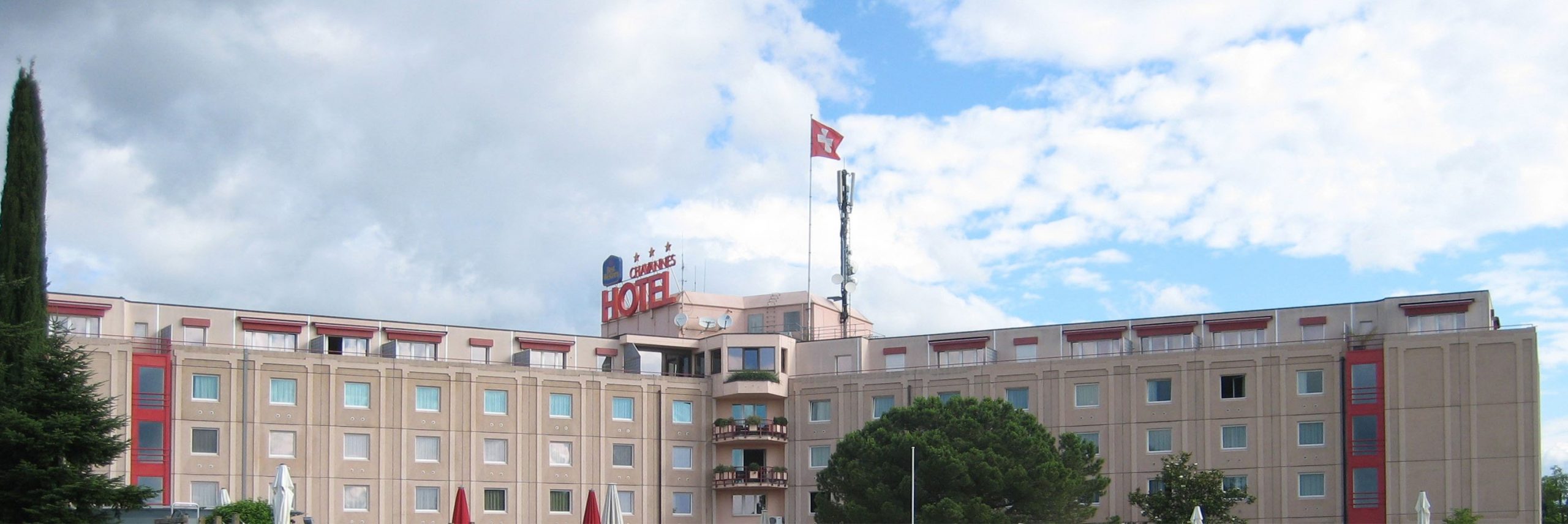
I like to give some substance to what l say, and it is not by chance that l work at Gitaly, whose main objective is to make your ideas, projects and desires come true. This is why l would like to deal with this subject by mentioning a project we have worked on, which concerns the facades of the Hotel Everness & Resort***.
It was beautiful indoors: the new strategy was to distinguish itself from the standardized and depersonalized hotel industry and to entertain a deeper connection with the customer. This research was reflected in a series of facilities: a new wellness area, modernization of the rooms (we took care of this, EVERNESS HOTEL), development of a bar-restaurant concept, transformation of the lobby. Everything was beautifully done, but from the outside the facades did not match the image of the interior. Let’s say that from the outside it looked like a completely different structure (remember the example above? This is the case).
Moreover, the Hotel is clearly visible from the motorway linking Geneva and Lausanne, the main road leading to Switzerland’s main cities, such as Zurich, Bern and Basel, so it was important to give character to the structure, which looked very insignificant from the motorway.
As the building is located in the middle of nature, the idea was to make it more surrounded by it by redesigning the facades.
In addition, we developed a concept that could “break the modules” by interrupting the extreme regularity and rigidity of the structure (look at the picture, it’s worth a thousand words) and also give it more verticality, considering its horizontal development.
Edgar Allan Poe said: ‘to hide something, you have to put it in full view’. Well, in such cases never do that, never paint an external staircase red to “hide” it if it doesn’t look the way you want it to.
In fact, we had to redesign the external staircase to make it part of the structure and achieve aesthetic improvement, thus harmonizing it with the concept of nature.
«A, B or C?»
I know what you are thinking but this is not a game show with one right answer. These are simply three different options that we analyzed in order to realize the facade project for the Hotel Everness & Resort***.
Let’s summarize our goals in 4 points:
● greater contact and harmony with nature and the surrounding environment;
● giving verticality;
● breaking up the modules, thus making the structure less rigid;
● improving the external staircase, by integrating it into the volume…
We carried out an in-depth study to develop the concept and to choose the materials to be used, selecting different options.
Option A
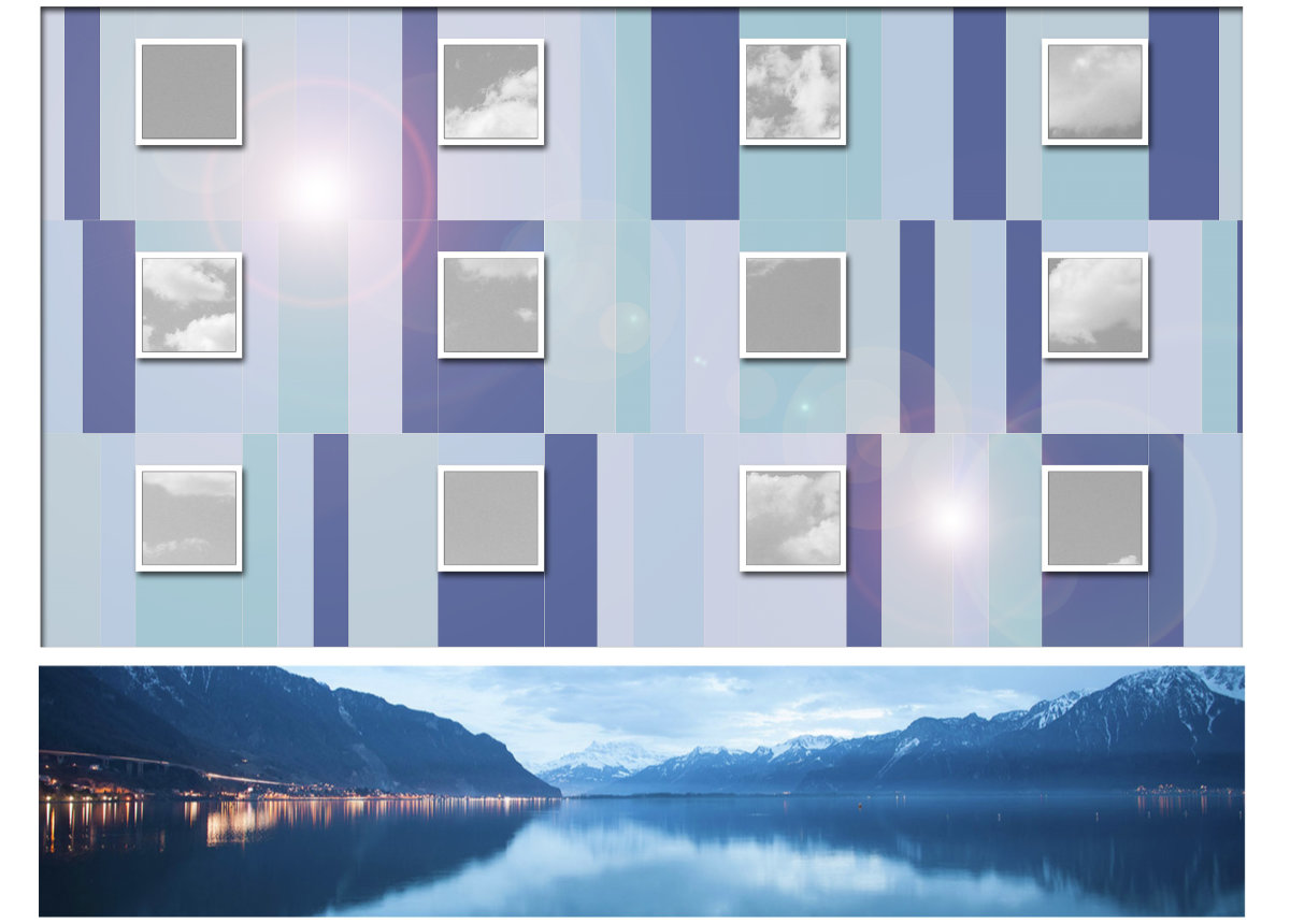
Materials and geometries inspired by the colour of the sky and the surrounding lake, capable of evoking strong vibrations.
Option B
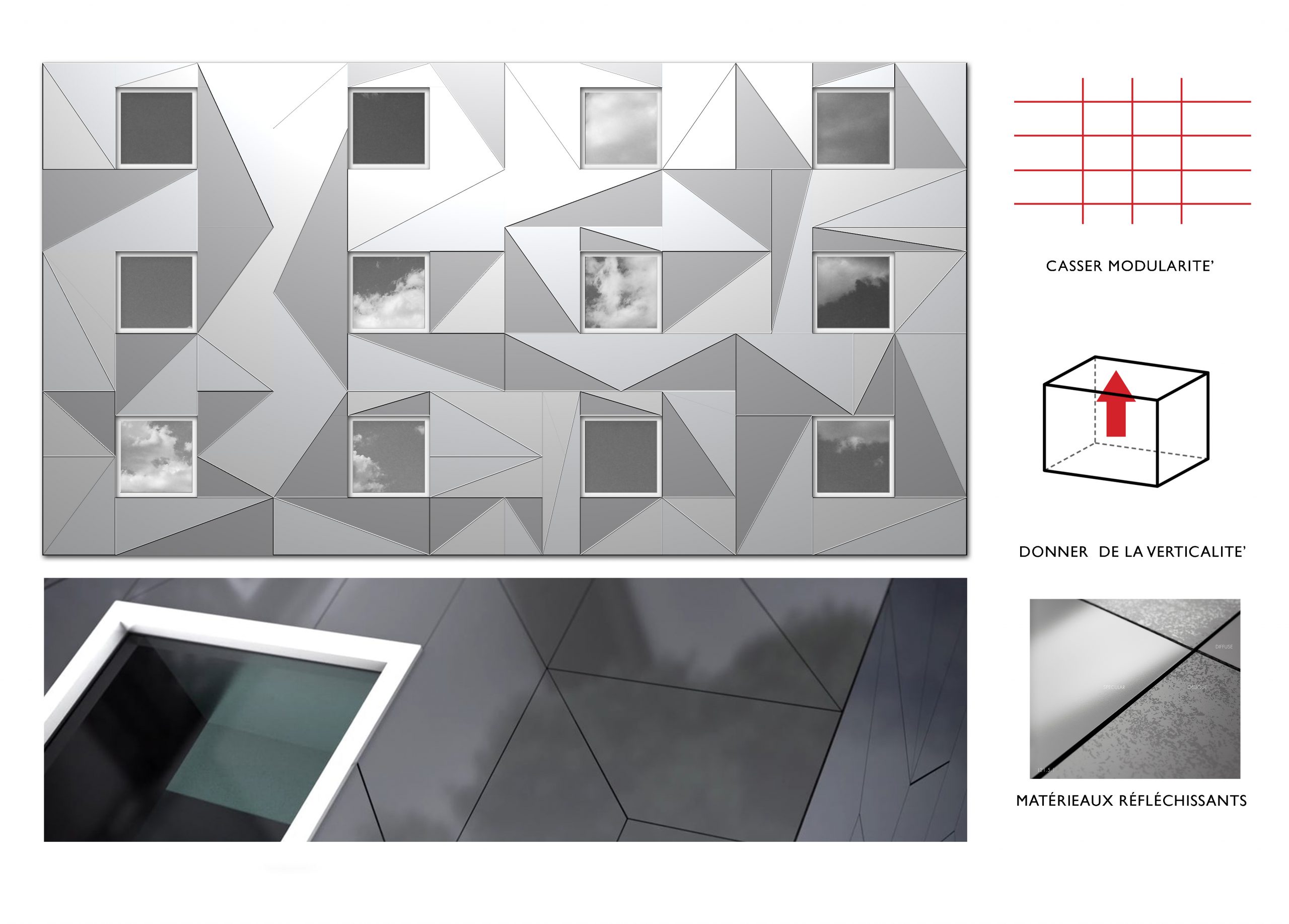
Reflecting materials that could capture the surroundings and the sky.
Option C
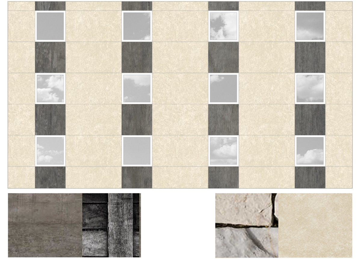
Natural materials such as stone or wood to create a strong link between the structure, nature and its surroundings.
In developing the concept, we were inspired by great masters (you can always learn from the best) and l am going to mention some of them for your knowledge and to show you the great work of preparation behind each of our projects.
Who better than the new residential building designed by Cino Zucchi at the Darsena in Ravenna to express the concept of harmony with nature and the surrounding context? Just think that the building was designed with a double face (I don’t mean that in a bad way, eh): on one side it responds to the existing urban layout and on the other it connects and opens up towards the water front of the adjacent river. The structure looks like a real mosaic, giving it verticality, while the colours recall nature.
For the choice of light-reflecting materials, we looked at projects by APA Zalewski Architekci in collaboration with the Trespa company, in which they used these elements for the facades, creating a kind of union and “play” with light and the environment.
«Which option would you have chosen for your Hotel? Which one did we choose?»
If you have come this far, l hope this topic will be of interest to you. Which of the above options would you have chosen for your project? Don’t worry, there is no wrong option and you don’t win anything. We chose option B.
We opted for a light-reflecting material, because our main idea was that the facades should reflect the sky and be able to change colour according to the sky and sunlight, which, when manipulated, can become a real design element, giving the facades a unique and different look at different times of the day.
The materials chosen are HPL panels by the company Trespa from the latest collection called Lumen, available in three finishes: oblique, opaque, diffuse (they differ in their reaction to light), capable of reflecting the surrounding environment, thus perfectly integrating the structure into it.
The colour thus comes to life through light reflections.

Now, a big question: what happened to the red external stairs?
I have already told you that they have been redesigned, but let’s see how.
For the development of the concept of the external staircase we completely embraced the idea of nature and vine leaves.
We wanted to create an association with this concept because the Hotel is surrounded by vineyards and both the bar and the restaurant serve various kinds of wine from the surrounding organic vineyards, as the Director proudly reminded us several times.
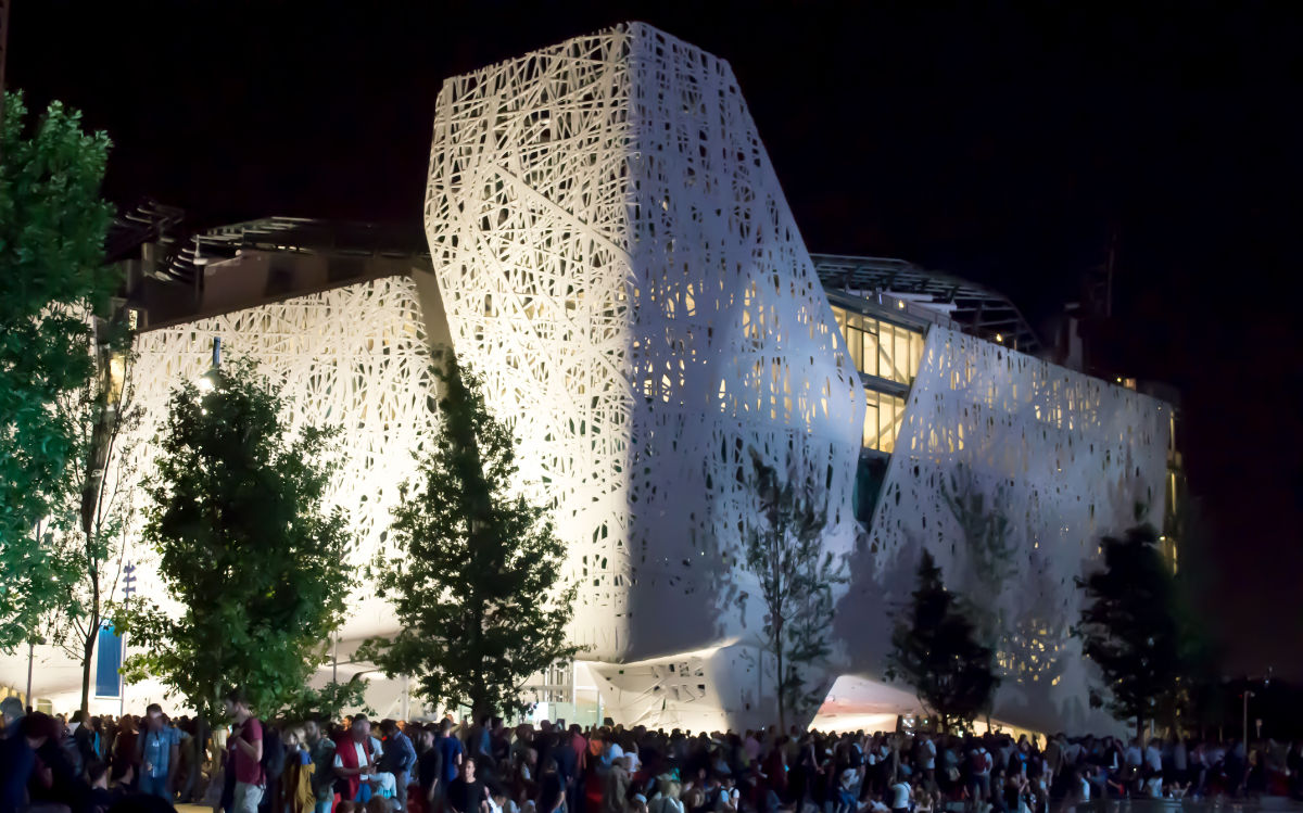
The stairs were therefore covered with a geometrically textured module with perforated triangles, illuminated at night by the interior lights, creating an intersection between the interior and exterior, incorporating the staircase more into the structure.
We were inspired (to name but one) by the designs made by the international architecture firm Snøhetta for some of their clients; we revised the shape and geometry to make the project unique and branded Gitaly.
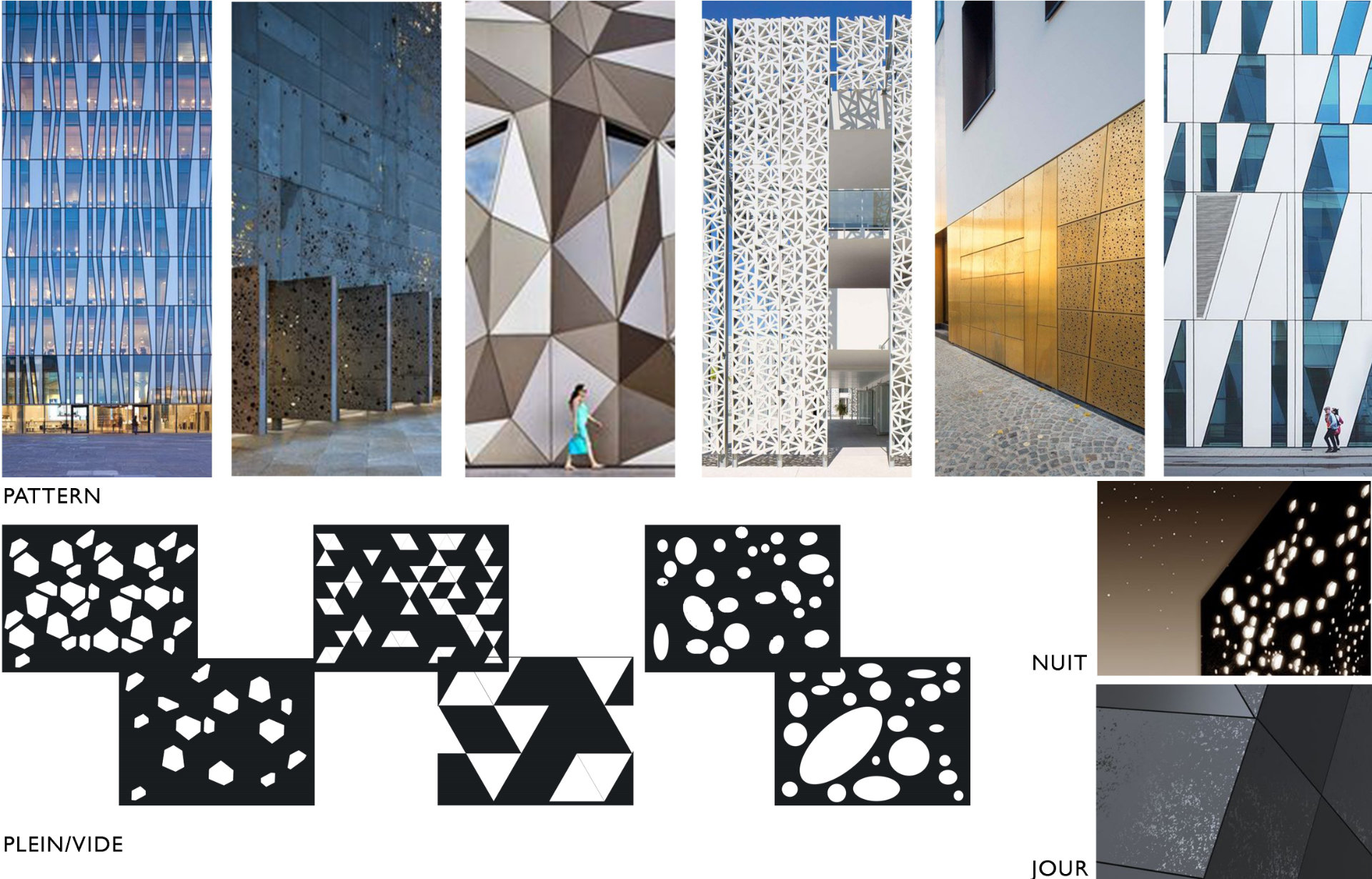
Look at the images, do they remind you of anything? Well, being the nostalgic Italians that we are, it takes us back in time to Expo 2015, Italy Pavilion. You may have seen a similar texture before….
We produced drawings on drawings to optimize the cutting and drilling of the panels and reduce material waste, and then we managed to install these elements without difficulty and make our customers satisfied whilst keeping timing and budget.
